Level 2 — Understanding Markets
Candlestick charts
5 minute read
What one candle tells you
Illustrative example · not live data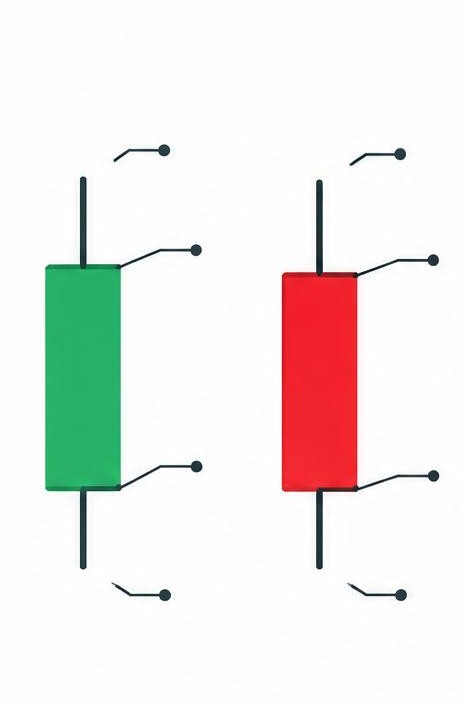
A candlestick chart is the standard way traders view prices. Each 'candle' shows what the price did during one period — one hour, one day, one week, depending on the chart.
Each candle has a body and two thin lines called wicks. The body shows where the price started and ended the period. The wicks show the highest and lowest prices reached in between.
A green candle means the price went up during that period (it closed higher than it opened). A red candle means it went down.
Candles tell a story. A long green candle shows strong buying. A small body with long wicks shows a battle between buyers and sellers with no clear winner. Learning to read these shapes is the foundation of chart analysis — and it's exactly what the charts on this site show you.
Key points to remember
- Each candle shows one time period
- Body = open to close; wicks = the extremes
- Green = price rose, red = price fell
- Candle shapes reveal who won: buyers or sellers