Level 4 — Advanced Market Analysis
Multi-timeframe analysis
5 minute read
Zoom from the big picture to detail
Illustrative example · not live data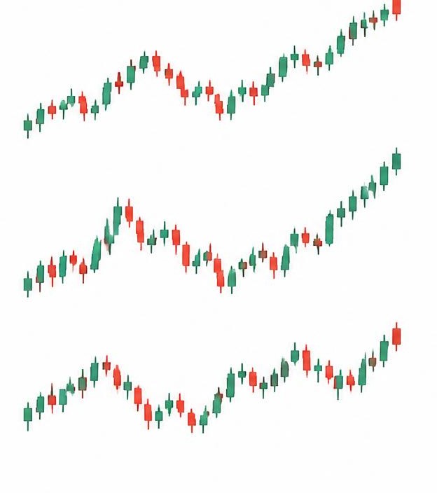
Weekly · overall direction
Daily · closer look
4-hour · short-term moves
The same coin can look bullish on one timeframe and bearish on another. A pullback on the daily chart might be a full downtrend on the 1-hour chart. Both are true at once.
The professional habit: start big, then zoom in. Check the weekly chart for the overall trend, the daily for key levels, and only then the 4-hour for timing. Trade in the direction of the bigger trend.
Levels from higher timeframes are stronger. A support level visible on the weekly chart has months of traders watching it; a level only visible on the 15-minute chart barely matters.
This is exactly why the AI Chart Analyst analyses the weekly, daily and 4-hour charts separately and marks different zones for each — flip between the timeframes on the chart and watch the zones change.
Key points to remember
- Trends differ across timeframes — all true at once
- Start weekly, then daily, then 4-hour
- Higher-timeframe levels are stronger
- Trade with the bigger trend