Level 2 — Understanding Markets
Supply and demand
5 minute read
Buying and selling areas
Illustrative example · not live data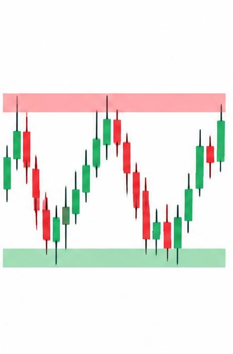
Supply and demand zones are areas on the chart where big buying or selling previously overwhelmed the other side — often because large players (funds, institutions) were active there.
A demand zone is an area where strong buying pushed the price up sharply. When the price returns to that area, those buyers (or others like them) often step in again. On this site's charts, demand zones are shaded green.
A supply zone is the opposite: an area where heavy selling pushed the price down hard. When the price climbs back into it, selling often resumes. These are shaded red.
Zones are areas, not exact lines — prices rarely turn at a precise penny. That's why the AI analyst draws them as bands rather than single lines, and why wider zones on the weekly chart matter more than narrow ones on the 4-hour chart.
Key points to remember
- Zones mark where big buyers or sellers were active
- Demand zone = buying area (green on our charts)
- Supply zone = selling area (red on our charts)
- Zones are bands, not exact prices