Level 4 — Advanced Market Analysis
Liquidation heatmaps
5 minute read
Estimated risk versus actual events
Illustrative example · not live data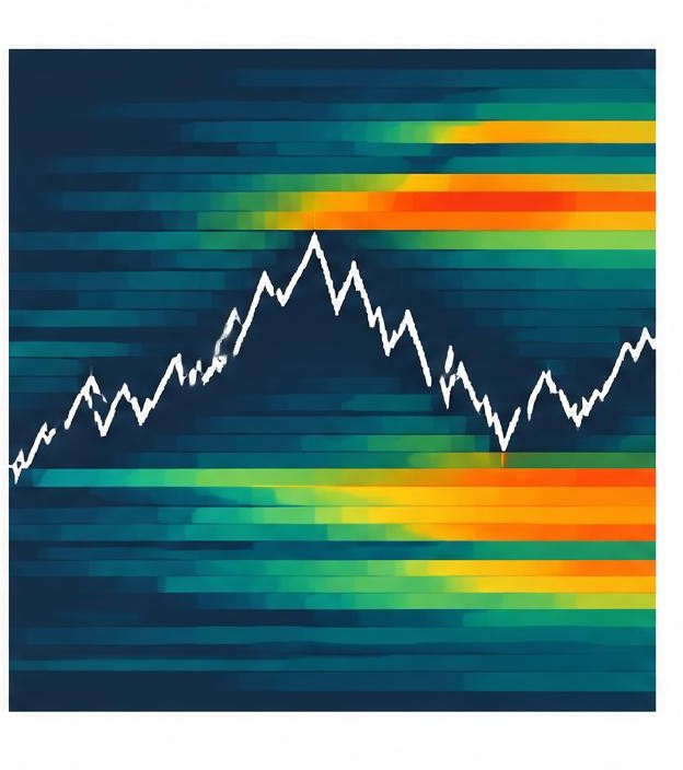
Heatmap · estimated clusters
Price reaches a threshold
Liquidation · forced close
A liquidation heatmap shows where large clusters of leveraged positions would be force-closed if the price reached them. These clusters act like magnets.
Why? When liquidations trigger, they become forced market orders — a cascade of selling (or buying) that pushes the price further in the same direction. Big players know where these clusters sit and sometimes push the price towards them deliberately ('hunting liquidity').
This is why prices often spike sharply to a level, trigger a burst of liquidations, and then reverse — the move had no genuine buyers or sellers behind it, just forced ones.
This site shows real liquidation data from OKX as dotted lines on the chart. Where you see recent liquidation clusters, the market has already been through a flush; the AI analyst factors this into its read of the market.
Key points to remember
- Heatmaps show where liquidations cluster
- Clusters act like price magnets
- Liquidation cascades cause sharp spikes and reversals
- Our charts show real liquidation lines from OKX